


How to Use Community Insight in Three Easy Steps
by Brian Herron and Hannah Krajniak
The Community Insight Public Dashboard is an interactive, online platform for displaying data about local communities, understanding community opportunities and needs, and targeting efforts for advancing equity. Community Insight draws on multiple datasets from a range of systems and institutions on topics such as unemployment, education, health, population demographics, and more.
Community Insight was created in 2020 after numerous requests came from foundations and nonprofit organizations for basic information about their communities. The majority of these requests covered the same data sets in varying geographical regions, which resulted in downloading the same data multiple times with different location filters. The platform provides an answer to these requests by presenting data from multiple sources, such as the U.S. Census Bureau’s American Community Survey (ACS), which covers every county, city, township, and census tract in the United States.
The first steps to using Community Insight are to set your default location and select an indicator to view data. In this example, we will choose Michigan as the default location and the unemployment rate indicator. Selecting an indicator can be done in two ways — by browsing the Data Dictionary or by using the search bar.
Data Dictionary
The Data Dictionary is located on the left side of the search bar and is represented by a dictionary icon. A great tool for those new to Community Insight, the dictionary lets you explore all of the available datasets in a single view. Simply search or scroll to find your desired indicator, then click view on dashboard to begin exploring the data.
Search Bar
The search bar is ideal for those who already have an idea of which indicator they need. To reach indicators through the search bar, begin typing your indicator name and select it when it appears.
Once you have selected your indicator, the next step is to select the indicator options. Click anywhere in the toolbar below the indicator name to expand the indicator options panel.
Data Filters
The first step in selecting indicator options is to select your data filters. Each indicator may be filtered by year, location, and data source. The year and data source are already selected, so simply click on the location dropdown and begin typing to find your location. In this example, we will select Grand Rapids, MI — though any county, city, township, census tract, and/or school district in the state may be selected depending on the indicator you chose in step one.
Each indicator may have additional filter types available for selection. Selecting the filter types will toggle additional filter options, such as race and ethnicity, gender, or age. In this example, the only additional filter type available is race and ethnicity, so we’ll keep the default selections.
Equity Comparison
The Equity Comparison function allows you to compare data among different demographic groups in the same area. In this example, we will compare the unemployment status among different races and ethnicities within Grand Rapids, MI.
The equity comparisons available depend on the indicator you select and are customizable to fit your needs. To change which races and ethnicities are being compared, click on the options dropdown. In this example, we will keep the default selections.
Location Comparison
The Location Comparison tool allows you to compare the data and equity results in your primary location with up to three additional locations within the state. In this example, the primary location is Grand Rapids, MI, and the location comparison tool will be used to compare Grand Rapids’ results with those in Kentwood and Gaines Charter Township.
To choose locations to compare results with, either use the dropdown menu to scroll and find your desired location or begin typing to search available locations.
After choosing your location and adding in any equity or location comparisons, click the blue update button to access the data.
You should now see data for your chosen indicator displayed as a map on the left side of the screen and as a line chart, bar chart, and data table on the right side. Each display is interactive, downloadable, and can expand to fill the screen or swap places with another display.
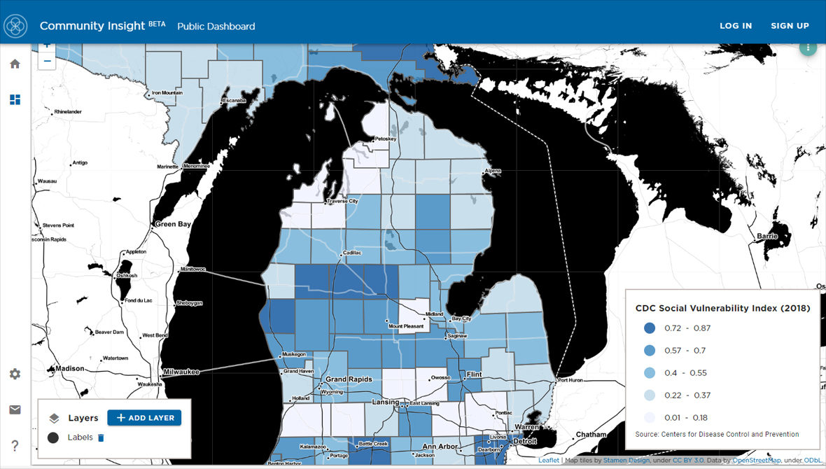
Map
The map feature allows for visualization of the data geographically, making it easy to compare locations. By hovering over a location on the map, a text box will pop up giving information on the indicator values in that geographical area. The map uses color to make distinctions in multiple ways:
Line Chart
The line chart provides an overview of how the data has trended over time and may provide insight into its growth/decline patterns. Each line on the line chart represents a different equity comparison, location, and the corresponding indicator value over time. To see a specific value, hover the mouse over your preferred line.
Column Chart
The column chart provides a snapshot of the data and clearly highlights the differences between the chosen equity and location comparisons. The colors assigned to each column of data remain the same as those of the map and the line chart. To see a specific value, hover the mouse over your preferred column.
Data Table
Located beneath the line and column charts is a data table that allows you to compare the data statewide. The data is laid out in a tabular format similar to a spreadsheet. When viewing the table, your selected location will be in the top row, followed by any selected location comparisons. Underneath your location and comparisons is the rest of the state’s data in alphabetical order.
Display Menu
In the upper right-hand corner of each data display is a menu icon with three vertically stacked dots. Click on these dots to view options to enlarge to full screen, swap the data layout, or download content as an image or spreadsheet.
Coming up in this blog series, we’ll take you on a tour of Community Insight to show you how to add layers to your maps, create your own user profile, and easily save and share your key areas and datasets of interest.