


Using Map Layers in Community Insight
by Brian Herron and Hannah Krajniak
Community Insight is an interactive, online tool for viewing community-specific data. Designed to help you identify community opportunities and needs, and target efforts for advancing equity, the Community Insight public dashboard draws on multiple datasets from topics like education, health, economic opportunity, population demographics, and more. Learn more about getting the most out of Community Insight from Jeff Williams, director of the Johnson Center’s Community Data and Research Lab, and read our three-step tutorial if you’re new to the platform.
In this post, we dive deeper into the map layer feature. This feature lets you concentrate on data most relevant to your area of interest by specifying locations and options. It also allows you to visualize the indicator data geographically, making it easier to compare locations.
To use the map layer feature, the first step is selecting your indicator location and filters. (Indicators and filters are outlined in more detail in this “how-to” blog post). In this example, our indicator is educational attainment, and the location selected is Durham County, North Carolina. Click here to view an image of this indicator in Community Insight.
Tip: The map feature is easier to view when expanded. To expand, click the three-dot display menu in the upper-right corner of the map panel.
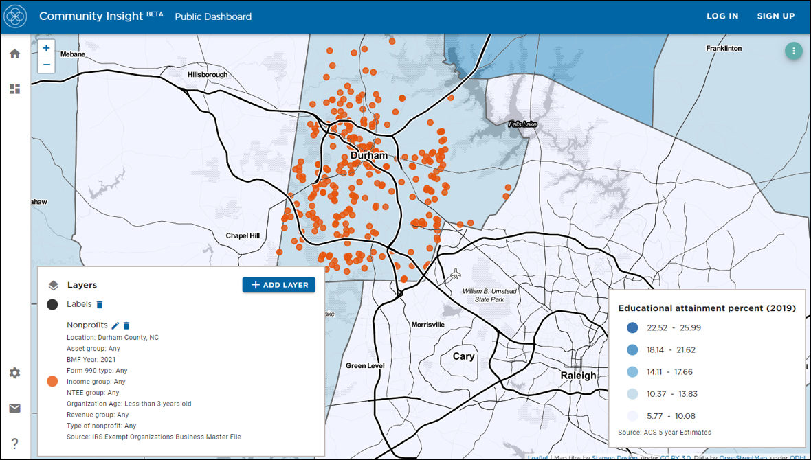
After selecting your location, indicator, and filters, step two is a map layer.
The legend in the lower-left corner allows you to add, remove, or edit map layers (you may need to scroll down using your browser’s scrollbar to view the legend).
Start exploring map layer data by clicking the blue “+ ADD LAYER” button.
A pop-up window lists available layers for you to view. In the example video below, we use the nonprofits layer to explore nonprofit organizations. Next, select your options. Options allow you to concentrate the data on what’s most relevant to your area of interest. This includes a location option allowing you to narrow your region of focus further to include specific cities, roads, bus stops, and more (depending on available data).
After selecting your options and narrowing your search area, clicking “SHOW LAYER,” the legend will display contextual information.
Each filter helps you narrow and focus the data. The information displayed in the nonprofits layer is sourced from the IRS Business Master File. Filterable based on unique data, this information includes several filters provided by this dataset, including location, NTEE group, organization age, and several financial data points.
In this example, we focus on location and NTEE group. The location helps match your chosen indicator data with nonprofits in the same area. The NTEE group is part of the National Taxonomy of Exempt Entities, a system used to classify nonprofit organizations.
As a map layer filter, it provides you with data on nonprofits that may complement your indicator. Click on the location field and type your desired location to make your selections. Here, we used Durham County, North Carolina. We clicked on the NTEE group field and selected the education option. After making your option selections, click the “SHOW LAYER” button.
Once your layer and options are selected, orange dots will appear on the map. Each dot represents a single nonprofit matching the location and options previously selected. Hovering over a dot, a text box displays an organization’s name. Click the orange dot to display key data points about the organization from the IRS Business Master File, such as the nonprofit’s EIN, address, age, NTEE information, or financial data points.
To download the nonprofit layer data, click on the display menu in the map’s upper-right corner, then click the download icon. In addition to the image and indicator data options, the new layer data option allows you to download information for all nonprofits currently displayed on the map.
To edit a map layer, return to the map layer legend in the lower left; click the pencil icon to change the layer options. To remove the layer, click the trash can icon.
Next in this blog series, we’ll walk you through creating your user profile to easily save and share your key areas and datasets of interest.